– Link
I’ve just linked my shop to my web blog, so that I HOPEFULLY get a little more coverage, i’m thinking every little helps xxx
– Link
I’ve just linked my shop to my web blog, so that I HOPEFULLY get a little more coverage, i’m thinking every little helps xxx
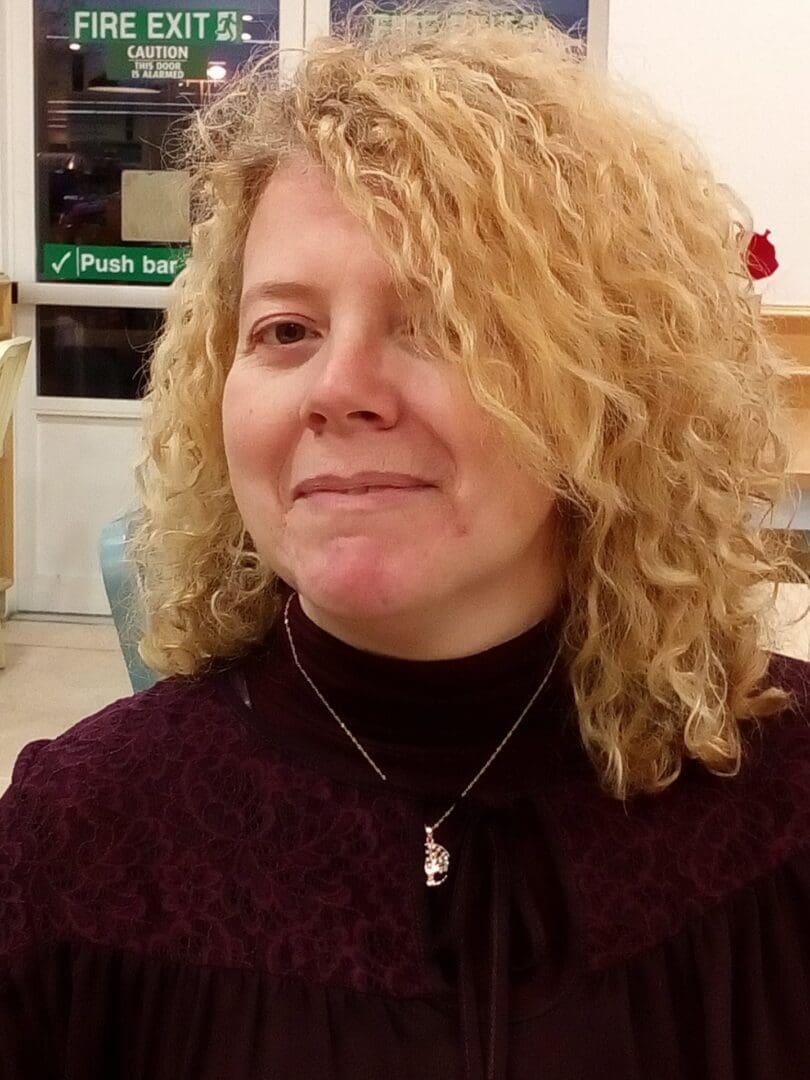
Thank you so much, for having me on your platform…
I’m Julie, and the shop is named after my first dog Boomer who has gone to live with the Angels.
However we have three other doggies (all black lab’s) who make our family so whole xxx

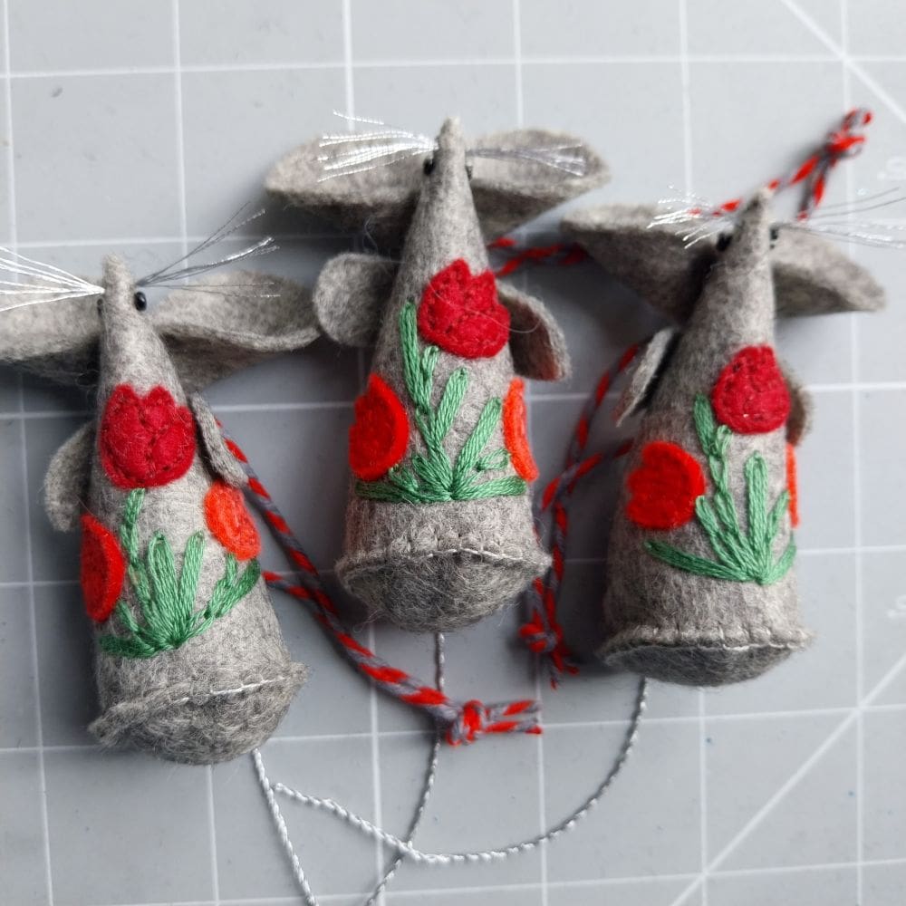
Whilst creating my Handmade Pretty Things, I cut everything out by hand so that I can keep waste to an absolute minimum!
I hate to waste anything, so any leftover felt that is possibly useful goes into my ‘bits and pieces’ drawer. It is getting quite full!
However I do end up with some quite tiny pieces of felt.
I am always looking for ways to use up all these little pieces of felt that I am accumulating.
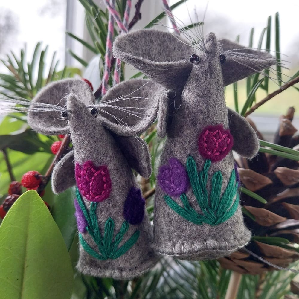
Something I have decided to try to do is to incorporate some of these smaller pieces of felt in my embroidery, especially my hand stitched embroidered mice.
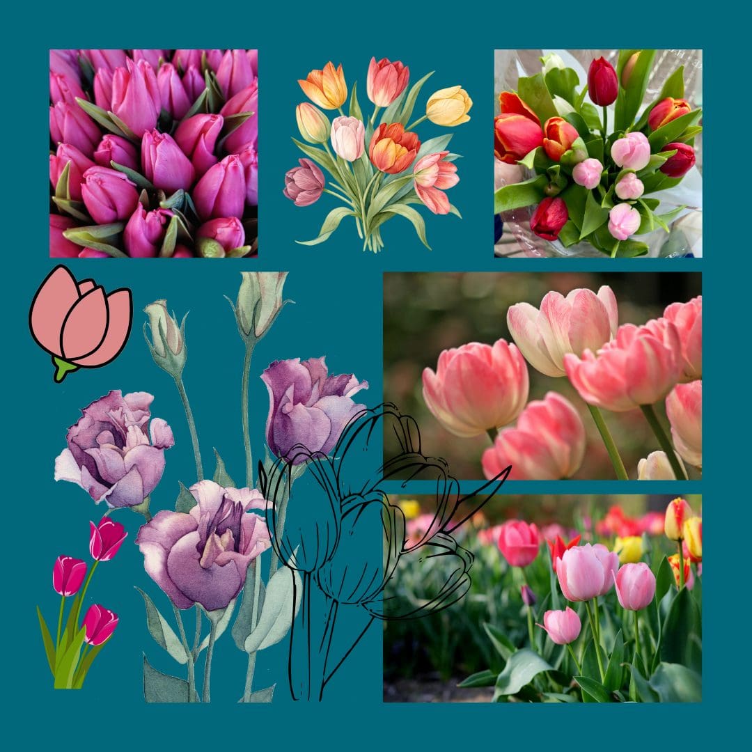
Firstly I looked at tulips for spring, the shapes and the colours

I then hand cut tulips and stitched them onto my felt mouse base with the tiniest of stitches, finally adding embroidery for the stems and leaves. I am so happy with the results.
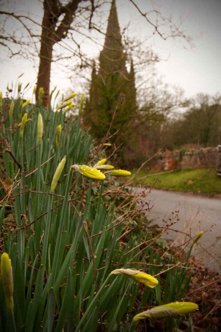
One of my favourite walks is a short stretch to a tiny village just along from home on the Wirral. It’s only a handful of houses, but it has always intrigued me.
At its centre sits a red sandstone church, settled in a dip in the landscape that somehow always feels colder than it should — even on bright days. It isn’t grand. It’s not particularly dramatic. Just steady. Surrounded by old church buildings, with a cobbled lane beyond that leads towards the stables.
Each spring, along the grass verge beside the red sandstone wall on the approach, the daffodils arrive.
They don’t line up neatly. They scatter themselves. A sudden sweep of yellow against old stone. They usually bloom a little ahead of the daffodils planted closer to the church itself — the colder air that gathers in the dip seems to hold those back slightly.
If anyone mentions daffodils, it’s these I picture.
Not formal beds. Not parks. These.
When I began making my own crepe paper daffodils,it was that stretch of verge I carried with me. I kept them in their bulbs, as though they’d just been lifted from the grass when no one was looking. Roots intact. Still connected to where they began.
Each handcrafted paper daffodil is shaped individually, designed to capture the clarity of early spring while lasting far beyond the natural season.
Their yellow is clear and uncomplicated. Their green quieter — like the grass before it fully wakes.
These paper daffodils inspired by a quiet village on the Wirral, sit easily on a shelf or in a quiet corner and stay long after the real flowers have faded.
A limited collection is available here at The British Craft House, each one individually made and carrying a small echo of that familiar stretch of road — the moment each year when you realise spring is quietly on its way.
Rebecca
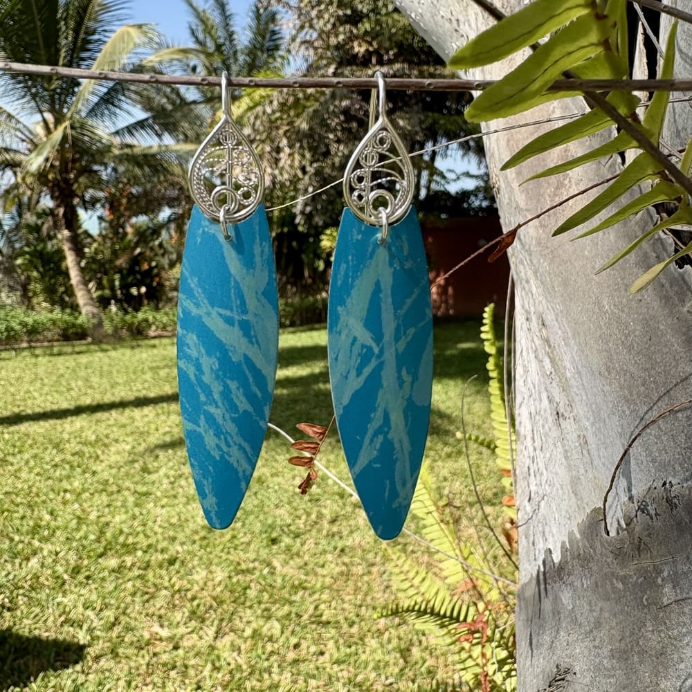
Turquoise is my favourite colour and for my recent tropical holiday in the Gambia I decided to try combining my love of silver filigree with some hand dyed aluminium and took these on holiday just for me! Of course they had to have their own little photo shoot on a palm tree in the gardens – other guests thought I was quite mad!! 🤣.
Now to decide whether to try some more!
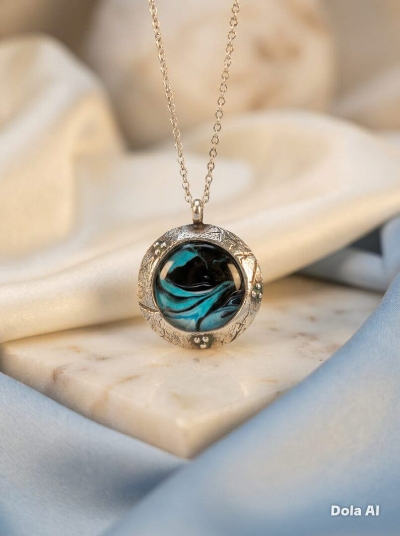
Having recently been accepted to sell my personalised gifts on The British Craft House, I can’t wait for my shop Emily Jane’s Creations latest journey. I am based in Kent by the coast and have been creating personalised gifts including photo collages, engraved gifts, sublimation products, cushions, wedding gifts and much more for 11 years. I am happy to create bespoke items so please feel free to reach out of if there is anything you would like me to create for you, thank you Emily x
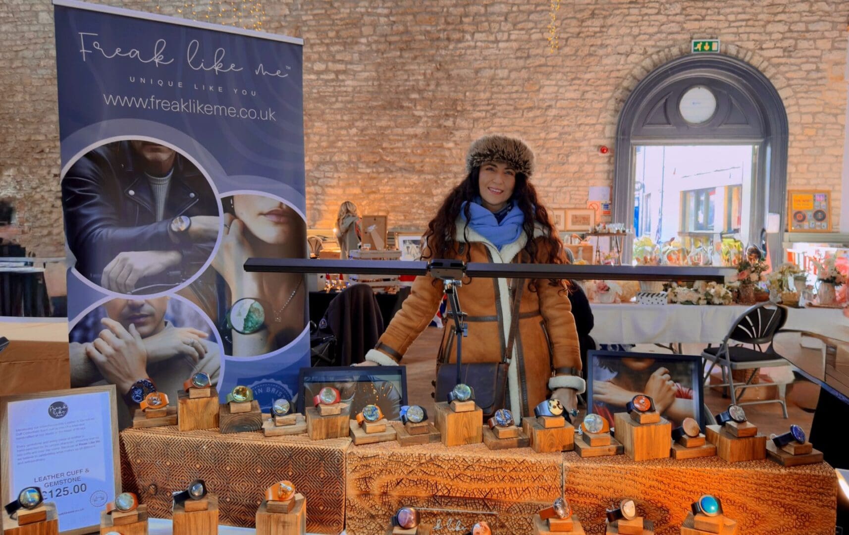
Last Sunday we packed up our leather bracelets, carefully selected gemstones and, of course, a good supply of coffee, and headed to the Vintage & Artisan Market in Cirencester.
And what a lovely day it was.
Cirencester has that rare blend of heritage and independent spirit – the kind of place where craftsmanship is noticed and conversations matter. From the moment the market opened, there was a gentle but steady flow of vintage enthusiasts, thoughtful shoppers and Sunday wanderers, all taking their time to explore something handmade and considered.
It felt like exactly the right setting for Freak Like Me.
We spent much of the day talking about gemstones – how each one is sourced, why every cabochon is entirely unique, and how our interchangeable design allows you to build a piece that grows with you. Watching customers try different leather colours, swap gemstones, and hold them up to the light to see the depth and inclusions is always a privilege.
There’s a quiet moment when someone finds “the one”. That never loses its magic.
It was also a pleasure to meet those who had discovered us online and were seeing the work in person for the first time. Feeling the weight of the leather and the texture of the stone brings a different understanding – something tactile and personal.
And then there were returning customers adding another stone to their collection. That means more than anything. It suggests these pieces are being worn, lived with and valued – not as passing trends, but as something lasting.
Days like Cirencester remind us why we began: to create honest, handcrafted jewellery that celebrates individuality and thoughtful making.
If you stopped by, thank you.
And if you’re still thinking about a particular piece, we’d love to welcome you online.
Mila x
There’s something quietly powerful about old silver jewellery.
It might be broken. It might no longer suit you. It may even be sitting unworn in a drawer — but it still holds weight, memory and value.
At Arvor and Mor, I work primarily with recycled silver because I believe precious metals should be used thoughtfully. Silver is a finite resource. Whether newly mined or refined for reuse, it carries environmental impact and real cost. That makes it worth honouring — not discarding.
Reworking old silver jewellery is a way of doing exactly that.
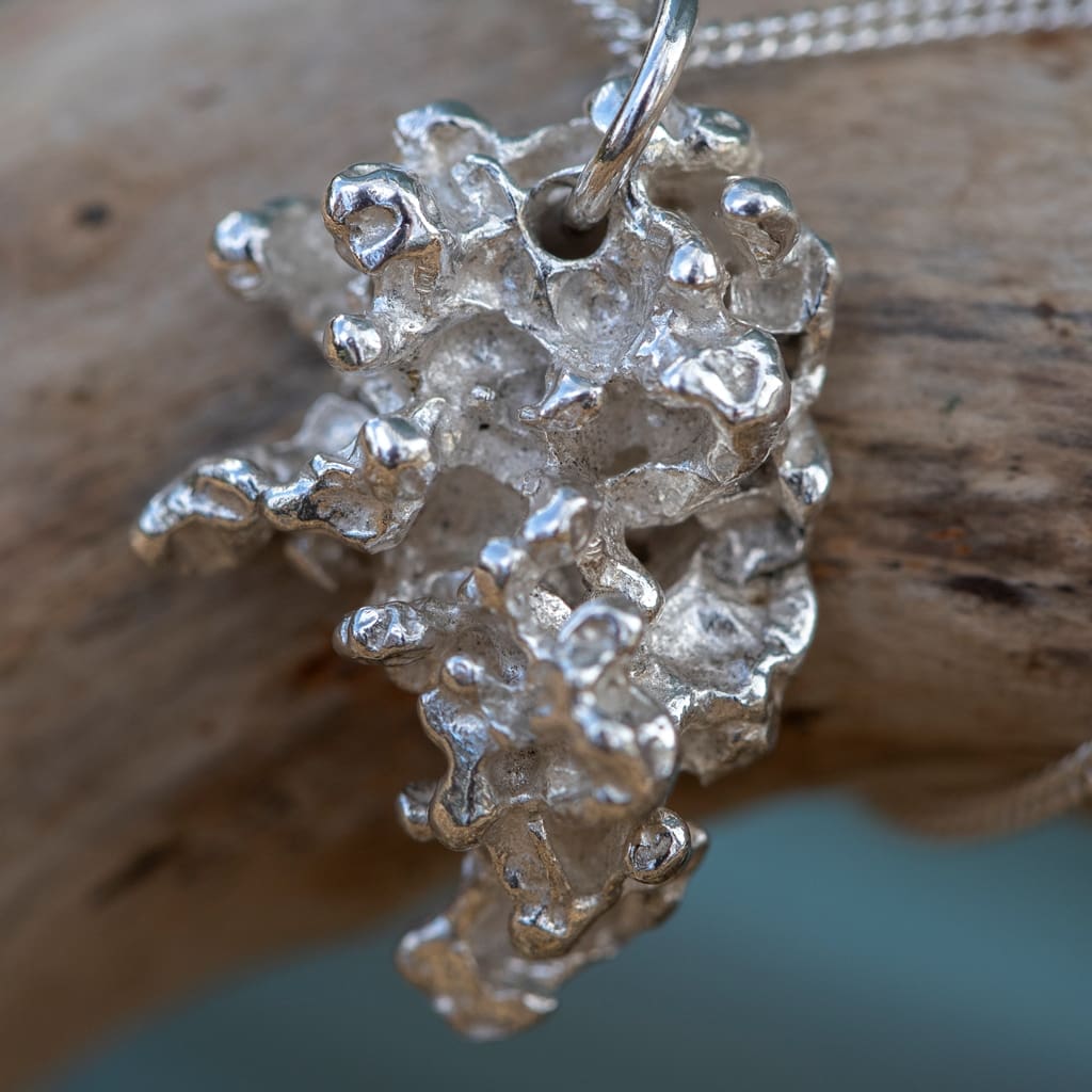
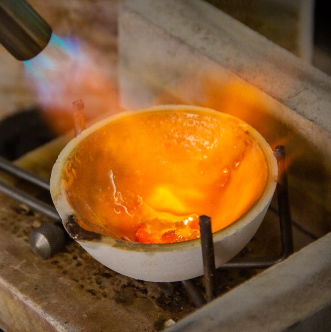
Instead of leaving unworn pieces hidden away, you can transform your own solid silver into a new design from a carefully considered collection. The silver used is yours — melted, reshaped and given a new chapter. And if you’d like to witness that transformation, I can even film the casting process so you can see your silver change form in real time.
There are many reasons people choose to remake old silver jewellery.
Sometimes it’s practical or environmental. Recycling silver jewellery you no longer wear keeps precious metal in circulation and reduces the need for further extraction.
Often, though, it’s about something deeper.
A piece may have belonged to someone no longer with us. It may have been passed down through family, carrying stories and connection. You might never wear the original design, but letting it go doesn’t feel right either.
Remodelling heirloom jewellery allows you to keep the material — and the meaning — while creating something you truly want to wear. The story continues, just in a different form.
There is also the simple reality that silver has risen significantly in price in recent months. While none of us can predict where markets will go next, it serves as a reminder that the silver sitting in your drawer is valuable — both financially and emotionally.
If you’re wondering how the process works, it’s straightforward.
First, weigh your silver. This gives you an idea of what designs are possible.
Next, browse the reworking collection here. Each design clearly states how much silver is required.
Once you’ve chosen your piece, place your order and I’ll be in touch with full instructions for sending your silver safely. From there, the transformation begins.
It’s important to note that I can use solid silver jewellery only — not plated pieces — and items must be free from stones, enamel or attachments.
Every piece created through this process is part of Arvor and Mor’s wider commitment to positive impact. I donate 2% of all sales to The Wave Project (with a few exclusions), a charity founded in Cornwall that supports children and young people through surf therapy across the UK. Reworking your silver not only gives your jewellery new life, it also contributes to theirs.
Looking ahead, I’m developing ways to offer even more creative freedom.
Using wax carving and traditional casting techniques, I’m working towards a more bespoke remodelling service — allowing you to shape and influence the design itself. The aim is to transform your old silver into something truly one of a kind. An heirloom piece ready to be passed forward again.
If that sounds like something you’d love to explore, keep an eye on this space — or follow along on socials @arvorandmor and sign up here for coastal stories and Arvor and Mor updates.
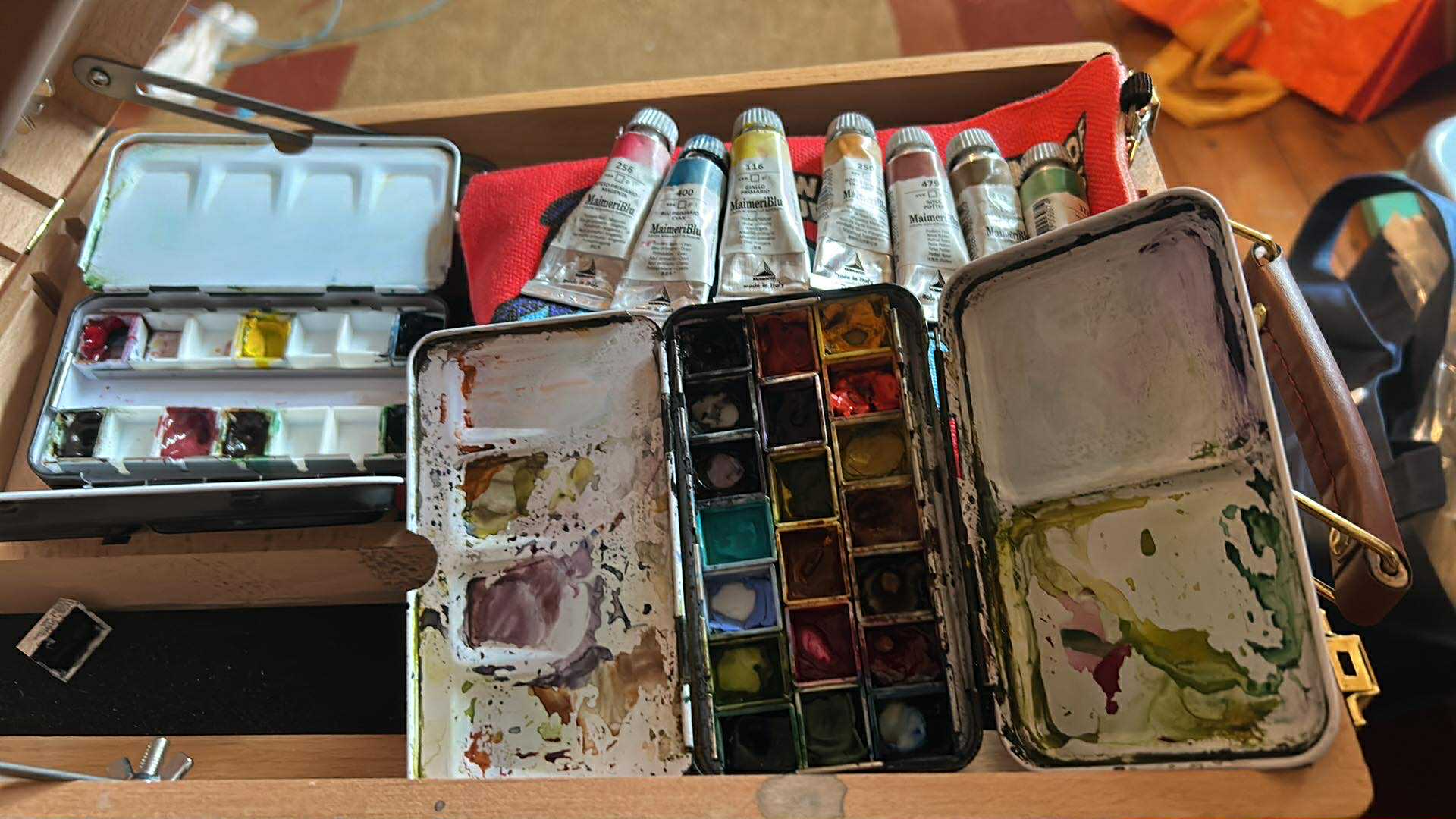
There is always that anticipated excitement of a package arriving and knowing it’s a fresh haul of watercolours!! Sadly, I dont have a specialised art supply shop locally, so its either an online order or a trip out to the amazing Bromleys in Bolton or The Art Shop Skipton for me.
This week, the anticipation is at an all time high as I’ve got samples from A. Gallo on the way. But before those artisanal Italian beauties even arrive, my watercolour box is already stocked with a variety of exceptional brands.
After years of using my trusty W&N Cotman paints, and the eventual realisation that there is a difference in quality with paint grades, ie the cheaper ones are less pigmented and use fillers. Around 5 years ago I was ready to explore an unknown world of professional grade watercolours. Where do I start? I soon realised there was a whole world of other brands out there, each with their own unique characteristics.
I started with Holbein – it was like a polite guest to the party. Because they don’t use ox gall, the paint stays exactly where you put it. It’s creamy, reliable, and behaves well and the colours are amazing.
QoR – The wild child. Thanks to their Aquazol binder, the pigment practically explodes when it hits the water. It’s chaotic, aggressive, unpredictable and incredibly fun to use!
Schmincke & Wallace Seymour – Then there’s the ‘old world’ charm. Schmincke is like refined German engineering, while Wallace Seymour feels like you’ve dug the pigment straight out of the British hillside.
Amidst all this variety, I landed on Maimeri for a very specific, stubborn reason, they’re all tubes of aingle pigments.
I wanted to explore the raw DNA of the pigment. My foundation became the primaries (cyan, magenta and yellow). They are wonderfully vibrant and full of light. It’s that luminosity that gives watercolour its uniqueness in the painting mediums.
Using just the primaries was a masterclass for me in colour theory and one I love to share with my students too. You can of course make some wonderful earthy colours from just these three primaries but as I do like a new tube of paint from the postie and the convenience, I complimented those primaries with a selection of earthy friends for my palette. Not because I just liked the colour (admit it we’ve all done that) but for the chemistry between these pigments.
Transparent Mars Red & Burnt Umber – these are my rusted, ancient anchors of the set.
Potter’s Pink – Basically just beautiful, granulating dust that makes everything look like a moody dream.
Cupric Green This pigment is the social butterfly among the paints. I chose it for its versatility, it’s the bridge between the bright primaries and the gritty earthy tones. I’ve always struggled with greens, even with my digital illustrations, green has always been a problem. As a standalone colour, cupic green is far too artificial looking, but mixed with any of the other colours in this limited palette, it creates muted shades and greens that I’m currently obsessed with!!!!
People often ask if I have a preferred brand. Honestly? I’m not sure yet.
Some days I want the polite precision of Holbein and other days I want to watch QoR go to war with a piece of paper. I love the heritage of Wallace Seymour and the single pigment purity of my Maimeri colours. And with A. Gallo about to drop through the letterbox, my loyalties are likely to be tested all over again.
My palette tells a story of growth and my understanding of pigments, and it’s a history of my own curiosity. I really love the science behind these pigments, and I love learning. Every brand and indeed pigment brings a different character to the paper (there’s a whole seperate blog on papers there isn’t there 😜)
For now, there’s no definitive verdict. I’m enjoying the fascinating journey into the world of what makes a certain pigment from a certain brand behave the way it does with another and I’m quite happy to let them all keep talking 🙂