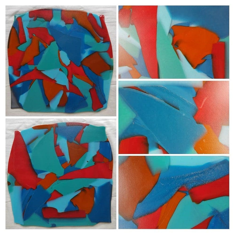
Colour as I see it, now.
As a creative artist and designer, I have come to love working with colour. But that was not always the case and as with most things it only came with practice, repetition and necessity.
Nature demonstrates its seasonal colours to us, in a constant repeat mode every year and there really is no such thing as clashing or the wrong colours where nature is concerned.
There is much to feel and observe, opposites to recognise, like warm and cool, sunshine and shade, clear and misty, light and dark, high and low, deep and shallow, glowing and receding, shiny and matte, sparkling or dull, reflective and absorbing, transparent and opaque.
The relationships between colours never fails to surprise and delight me.
However much information there is, that can be taught about the theory of colour, I believe you have to use it, experience it and create associations that may conflict and even be doomed as failures, in order to observe and discover that the variations  possible are as wide ranging as our personalities, cultures and climates of each and every continent of the world that we live on.
I understand that there will be some people who cannot see colour as I do, just as they can hear what I cannot. Those who choose to dress entirely in black or have an all white house and decor or just want everything natural and neutral and in doing so, I think are missing out on the wonderful world that colour can offer.
Even with Black, there are Hues of Colour, within Black.
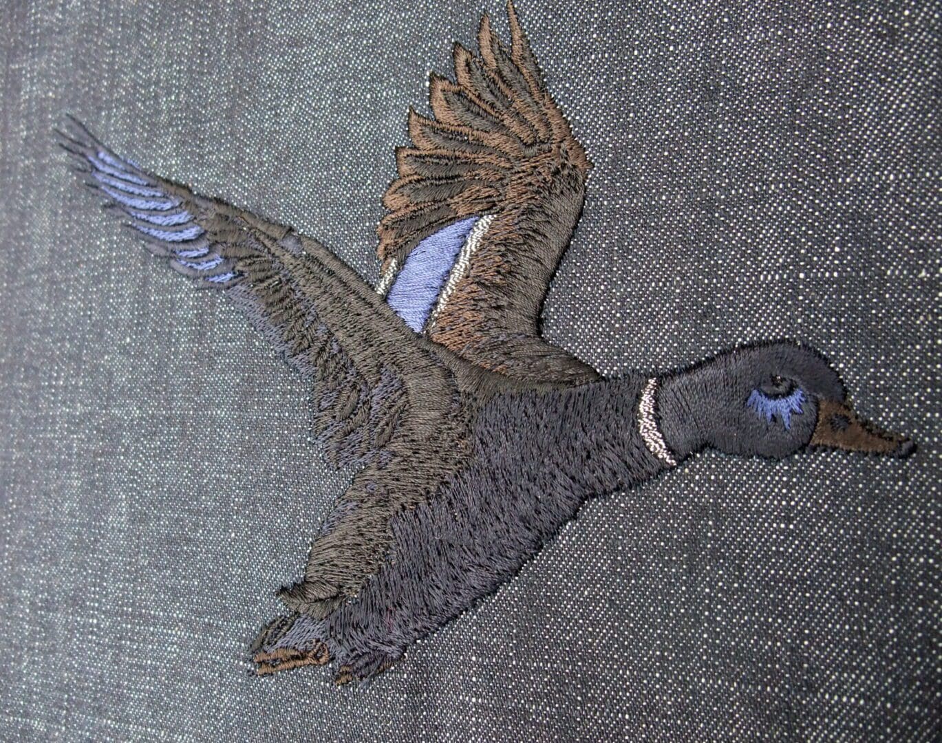
- Commission by Pauline Thomas
Taking a look at my thread suppliers shade card there are 5 shades of black, their differences only become apparent when used close together and next to their own colour groups, as I did for this Mallard Duck commission.
Even so called safe beige will have a slight tint or hue in it, taking them into one of the colour families, be it with hints of pink, yellow, green or blue.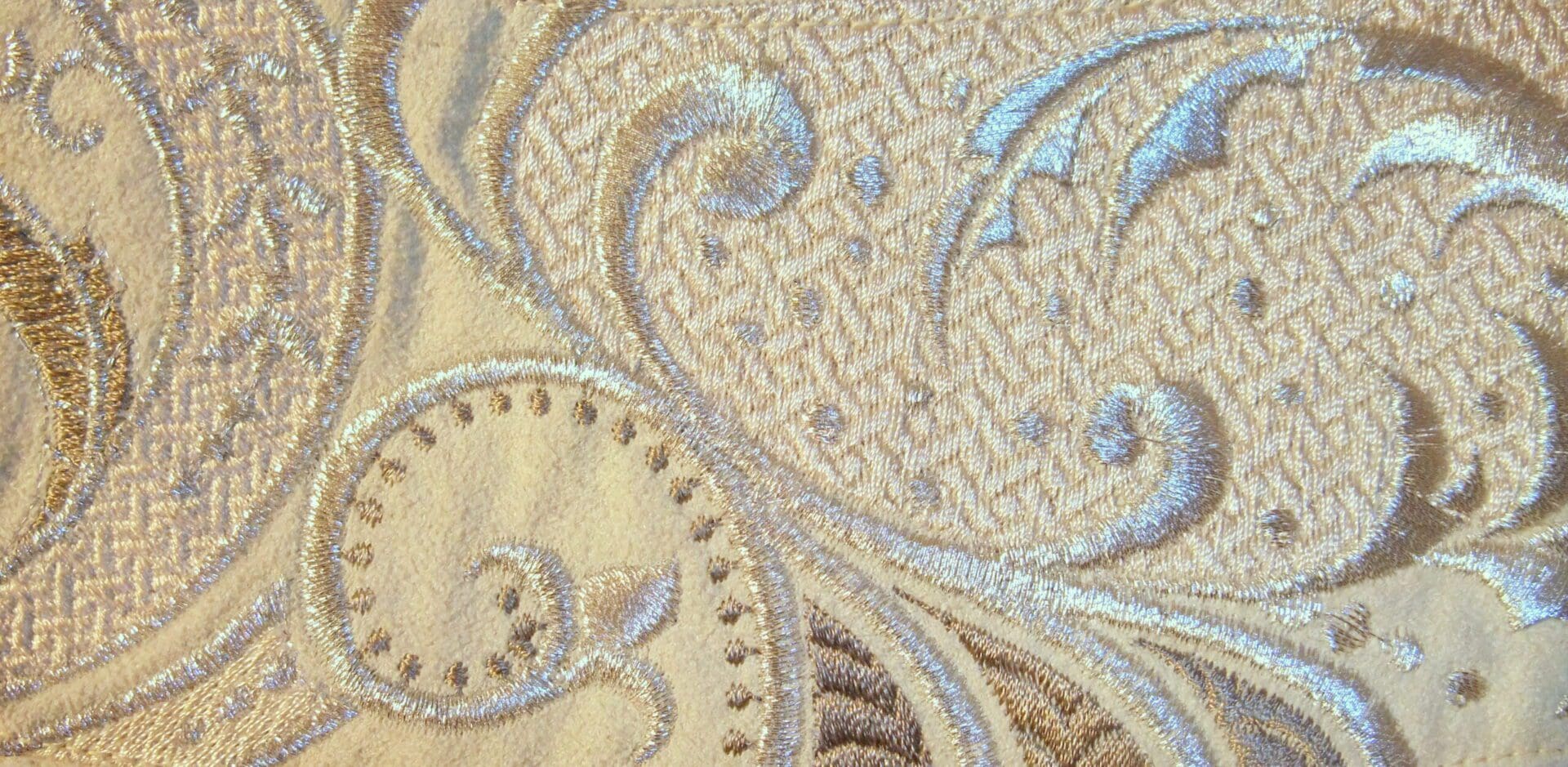
Colour is such a personal thing too, and anyone who is creative with it, whether or not they are artists or designers will probably subconsciously at first, go on to create their personal pallet of colours as part of their own signature style that embraces their personal life experience and preferences.
My Mum always had a very conventional and conservative sense of what colours one should wear and with what. That clearly influenced the clothes she wore and those that we had to wear as her children. She was creative in making clothes, for her three girls, of which I was the youngest and we were often all dressed exactly the same and I got to wear the same style and colour dress, across three sizes for about 7 years! Fine if I liked it, not so good if I did not… tough!
The consideration of whether a colour actually suited any one of us never came into the equation at all, as siblings, we were all so different anyway and materials and colours available were so much more limited then. As a child, I knew that I always had the pink towel or the pink napkin at the table and for a while I even considered by default, that it was my favourite colour, along with red, which I seemed to wear most of the time. It was not until I was in my early twenties, that I realised that pastel pink, was perhaps not one of my favourite colours after all, nor did it really suit me either. As for red, I now know to treat the variety in a red, with much more careful consideration because you see, red is not just red…… it has all these warm and cool variations in between. The names of colours like Cherry red and Flame red, give out a lot of clues.
The explosion of colour that followed the post war austerity, in fashion during the 1960’s around the development of chemical dyes, had a radical effect on new, brighter colours that were becoming available, using newly developed synthetic fibres, creating incredible dayglo and fluorescent colours.
I remember choosing a very brightly coloured cotton fabric to make myself a dress, which my Mother was disdainful of, simply because it had bright acidic yellows and mustardy greens mixed with bright shocking pinks as well as pastel pinks and lilacs, all similar tones, which in her eyes did not go together at all. She was adamant that one should never put pink with yellow. I loved that dress, not just for the rebellion it created, but because it suited me and I can still see it in my minds eye, sadly nothing remains of it anywhere, not even the notebook cover I made with remnants of it, clearly banished forever, once I left home.
 It is no surprise to me with hindsight, that I have unconsciously been defying her theory, in the nicest possible way ever since and proving that yes… pink can work with yellow!
Red and gold are well known classic combinations and so with a moderation on that to a faded red you can have dusky pink with muted yellow. Gold, aka yellow was creeping in by my creative back door… without me even realising it at the time.
I did my degree in Ceramics and Three Dimensional Design, despite loving textiles as well, but my education and understanding of colour was yet to really start, so I doubt whether I could have thrived on any textile degree course, when faced at the crossroads of choosing which course and college to apply for.
We had covered colour theory and tones on our Foundation Art course, but its practical applications for me at that time were limited. I clearly understood three dimensional form much better, so colour got rather left by the sidelines when working in the monochrome world of wet grey clay and white plaster.
I loved being in the ceramics studio, but all the physical processes often took weeks and when my bisque pots came out of the kiln from their first firing, ready for glazing, I found that I had rather lost interest by then and I realise now, that time was an important factor too. Most of my ceramic creations ended up with just dark black or white glazes to show off the purity of their shapes, with maybe just a hint or line of gold lustre to highlight the edges of the form or create a simple motif detail, creeping in as a classical and traditional final touch.
I simply did not use colour enough then, to get a better understanding of it. As a young art and design student I had found colour and the actual mixing of colours using Gouache paint, an extremely solid opaque and flat paint which was the new and trendy must have medium for designers at that time, quite difficult to handle and design with, so I avoided it, there were plenty of three dimensional challenges to deal with instead. I think at this point, my vocation as a designer, using skills, based on a craft, were much more successful, than wielding a paint brush as a fine artist.
It was not until 2 or 3 years after graduating that I returned to textiles and thread in particular, finding that it could offer a spontaneity with consistent results which I found very exciting and satisfying. I have always enjoyed making clothes and items for the home, now I found myself happy to experiment in a less practical manner and finally began to gain the skill and confidence to understand colour better. Like that of opposing or complimentary colours, as seen on opposite sides of a colour wheel and understanding why some colours ‘sing together’ enhancing each other. An obvious one being red opposite green, who can fail to admire a green field full of red poppies. This theory of opposite colours is all well explained in any text book on colour.
As my ‘Thread Painting’ skills developed, my monochrome efforts that emerged from the machine needle as if I was drawing with a pencil, slowly evolved with increasing amounts of colour and lots of Poppies!
Which you can read about in my previous blog-
Creative Beginnings of an EMBROIDERER allergic to sewing by hand with needles….
Colour never fails to excite me now, as my drawings are recreated into stitches, discovering what combinations work together and how to get the best from them, means that I am always up for a surprise and accept that working with colour is always going to be an ongoing experiment.

In the early stages of a new design, while considering the translation of my drawing into stitches, the first consideration has to be the tones primarily and then colour, before getting involved with the technical aspects of digitising. It is crucially important to establish what needs to be light and what needs to be dark. ie tone. Colour can be ever changing and developed as the design evolves over time. But tones of light and dark in any composition need to be set first, whatever the colours they may actually be.
I have now built up a confidence and repertoire from what I think works and what can always be improved, and always taking my cues from the base colours of the fabric or garment as the starting point.
Every now and then I dare to be harmlessly reckless with it, just to see what happens.
A wild serendipity, how I love that word!
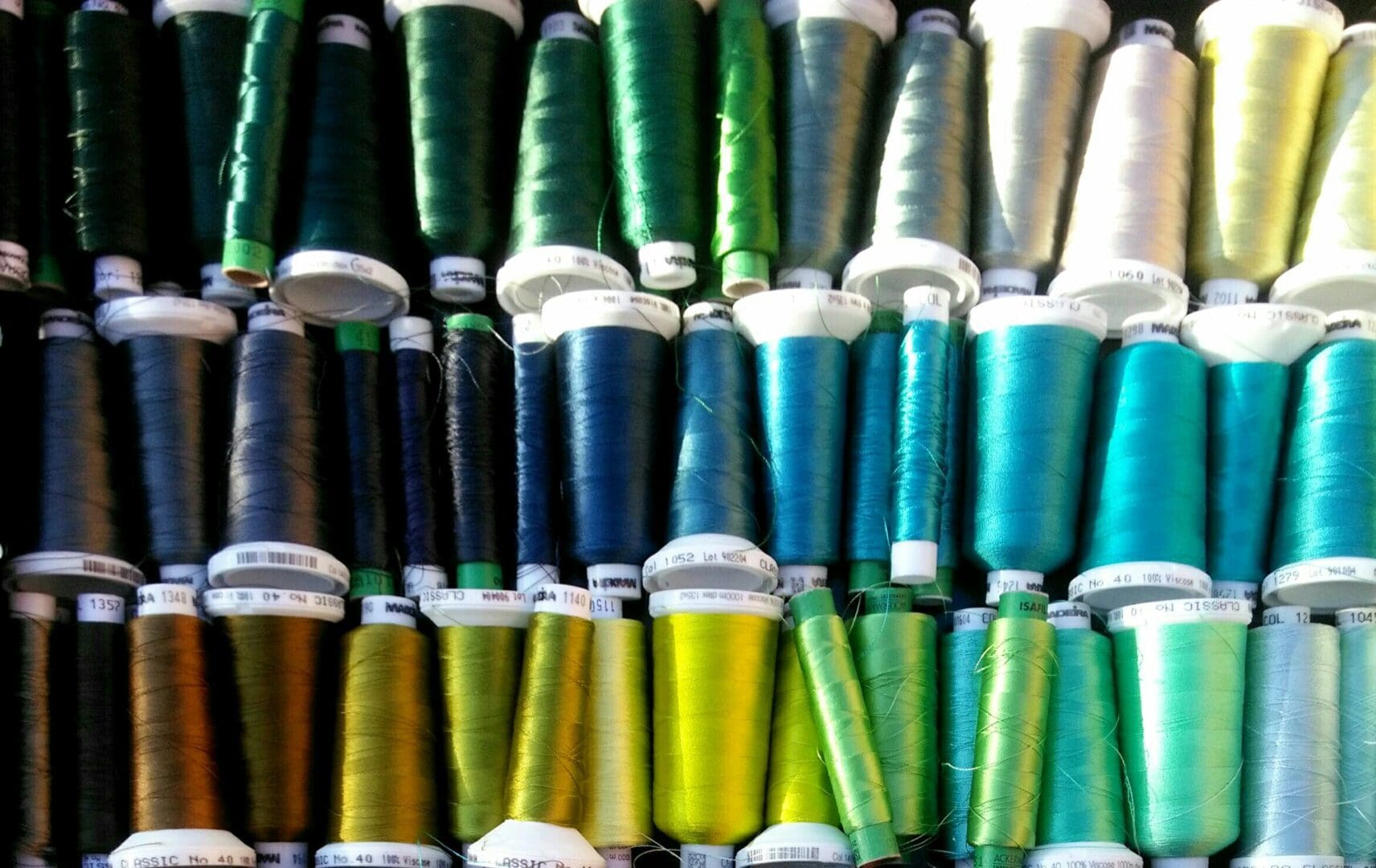
My palette of thread reels, usually looking a bit more chaotic and wild than this tidy one for this photo, can be found in some sort of order by colour, that of green, reds, browns and blues and there are always some reels that could justify being in more than one drawer. Opening each drawer storage and you will find light to dark colours of that colour family as well as the warm to cool category of that same group.
My machine embroidery thread is a solid presence in those drawers, their reels much less elusive than mixing paint colours and much easier to recall and have ready to use. But just to complicate things even further the highlights on the sheen of the threads create even more colours. Take a look here at each reel and you will see at least 4 more colours in each and every one of them.
As a thread, they are colours dispatched as a single, thin dashed but continuous line, through the machine needle, that can be thickened and made more intense by the basic machine stitch styles chosen – running, bean, satin and fill stitch, to name just a few.
The thread lines of two colours can be blended or patterned in such a way so as to create a suggestion of a totally new colour, like that of woven checks and tartans or shot silk.
Colour can also be transparent or opaque.
Let me suggest the following familiar opposites. as examples –
Watercolour v Oilpaint
Woodstain v Gloss paint
Fabric dye v Screen printing ink
Drawing inks v Gouache paint
Voile fabric v Velvet.
Even computer graphics offer transparent colours v opaque colours. Which when overlapped can to create a third colour as well as solid colours.
Let me now go backwards just a bit, to when I was newly married, living in a Chiltern village and getting to know my local community. Party plan marketing was trending, thankfully beyond Tupperware, into clothing, cookware and makeup and so I was persuaded to hold a Jafra cosmetics party for a group of ladies in our tiny cottage. in the hope that I would get to know more local people and earn some commission too.
The lovely consultant who talked us into buying after demonstrating the products was, I was later to learn, a top performer in the local amateur dramatics group and had us either all in stitches as the dame in the annual panto or delivering with vocal expertise her more serious memorable roles, so you can imagine her presentation for the party plan evening was confident, articulate, amusing and very well delivered. The thing that struck me most about her presentation of the unique selling point and philosophy behind this range of cosmetics was about colour and in particular centered around what personal seasonal range we each were.
She then went on to identify each one of us in turn, as being either Winter, Spring, Summer or Autumn using eye and hair colour, and skin tone to diagnose a category of being warm or cool. Some people fell into both the warm Spring and Autumn range, as I did, or were more suited to the cooler shades of Winter and Summer, also White versus Cream? All demonstrated with seasonal colour range cards much in the way a modern colour consultant would do your colours and give you a swatch of all the colours , tints and tones that suit you.
This was all quite an eye opener for me, despite my art training, as colour had never been discussed at college in terms of personal radiance, clothing or fashion.
It was a fascinating analysis, being quite novel at the time and the cosmetics being offered were in these seasonal ranges. So I embarked on my Spring journey, discovering colours that I had not considered wearing before, that indeed made me feel and look better in.
This clarified so clearly why some colours do not suit you and you can then avoid having a wardrobe full of such dubious colour mistakes in future and an understanding why some things never get worn.
Colour agencies that can ‘do your colours’ abound everywhere now and have gone even further with the concept of taking in body shape and silhouette as well.
When I get up in the morning I like to take a moment to decide what I am going to wear, what colour do I feel like wearing today? This is usually the first question I ask myself, then resolve it with practicalities and availability. The colours of my clothes clearly reflect not just how I want to feel, but I like to acknowledge the summer season and light, with the brighter spring colours that I can wear and leave the darker autumn colours and black to the winter and those dark nights of glittery celebrations or warm glow of fireside and candlelight.
My embroidery and its colours were now being used for embellished clothing, leisurewear and accessories, and had to appeal to the buyer, if they were to purchase my work. Their personal concept of colour was another new hurdle to overcome. So colour in fashion, the combinations and success of it became very important elements to consider as well.
The base fabric of a garment may no longer be a white blank canvas or the equivalent of a pristine sheet of white paper, it is a colour and may be dark or light and presents another whole new challenge, where colour is concerned.
I will give the following scenario as a typical example. I know the exact shade of green thread and its number that I want to use to depict that bright new beech leaf green in the spring, I know it will work perfectly on a white base fabric.
Now here is the challenge, this time the background fabric of the item that I am decorating is already a colour in itself, lets say it is a mustard coloured cushion cover. Place on it your dependable bright beech green and suddenly it does not look that colour at all, its gone all turquoisey blue… not green at all, what has happened?
It took me a while to understand that the base / background fabric colour will leech out is own colour from the new additional colour you sew on top of it, so the nice bright beech green has had all its warm yellows leeched out of it, then it is going to appear to be be left with proportionately more blues and may even cease to look green at all.
This can be treated either as a disaster or an exciting new journey.
Another less obvious challenge is sewing with contrasting tones, for instance an embroidered letter in pale pink onto black fabric, the contrast is now so great that the pale pink will no longer look pink against the black, it looks bleached and almost white, so the pink chosen has to be a darker stronger pink than you planned to make it appear as pink as the original shade of pink originally seen on a white back ground fabric.
I would get frustrated when presented with the exact pantone colours of a brand or logo, which was often presented and specified on whitepaper that a company would insist on for consistency, when the implications of using it on fabric and textiles never took into account these necessary compromises to reacting colours.
When I was asked to create embroidered corporate or club wear with brand logos or crests, I often had to use a different set of coloured threads on the ‘red jacket’ to that done on the white shirt of the same design, just so the branding ‘appeared’ to look the same colours and be consistent across the whole range.
Welcome to my world. One has to anticipate and work with these issues and I love to use colours now to just see what happens … it either works or it doesn’t, you can love or hate it and I know I can adjust things as soon as a few stitches are made by changing something there and then or just improve on the next one I make.
Despite an extensive repertoire and experience of colour now, I still get that tingling excitement of expectation watching the thread colours that I have chosen being run out on my embroidery machines.
My very first commercial embroidery machine only had six needles so I had to limit the number of colours to 6 in a design and get clever with creating the illusion of more colours if needed, by the way I embroidered and mixed those threads.
This was a useful discipline to get used to, as I came to realise that my most successful designs might only have 3 colours or 6 at the most. Too many and it can end up as a bit of a muddy muddle.
Next time I get out my watercolour paints, I am going to restrict myself in the same way. My favourite artists, use a restricted palette, it reduces the choices and hopefully makes the process of creativity easier.
As a creative artist, designer and maker, I have come to really enjoy and celebrate colour, I hope you can too.
My name is Pauline Thomas, I am not always hearing, but always looking,
always creating and I love what I do.